Sad Girls Club
Sad Girls Club began as a grassroots initiative by founder, Elyse Fox, who found herself suffering with depression in 2017. Elyse wanted to tear down mental health stigma and create a safe space for women (in particular Gen Z and millennial women of colour) who are going through their own journey.
SAFE SPACE, FRESH LOOK, REAL TALK
Client
Sad Girls Club
Sector
Charity & non-profit
Location
US
We partnered on
Brand vision
Brand purpose
Brand personality
Tone of voice
Branding
Logo design
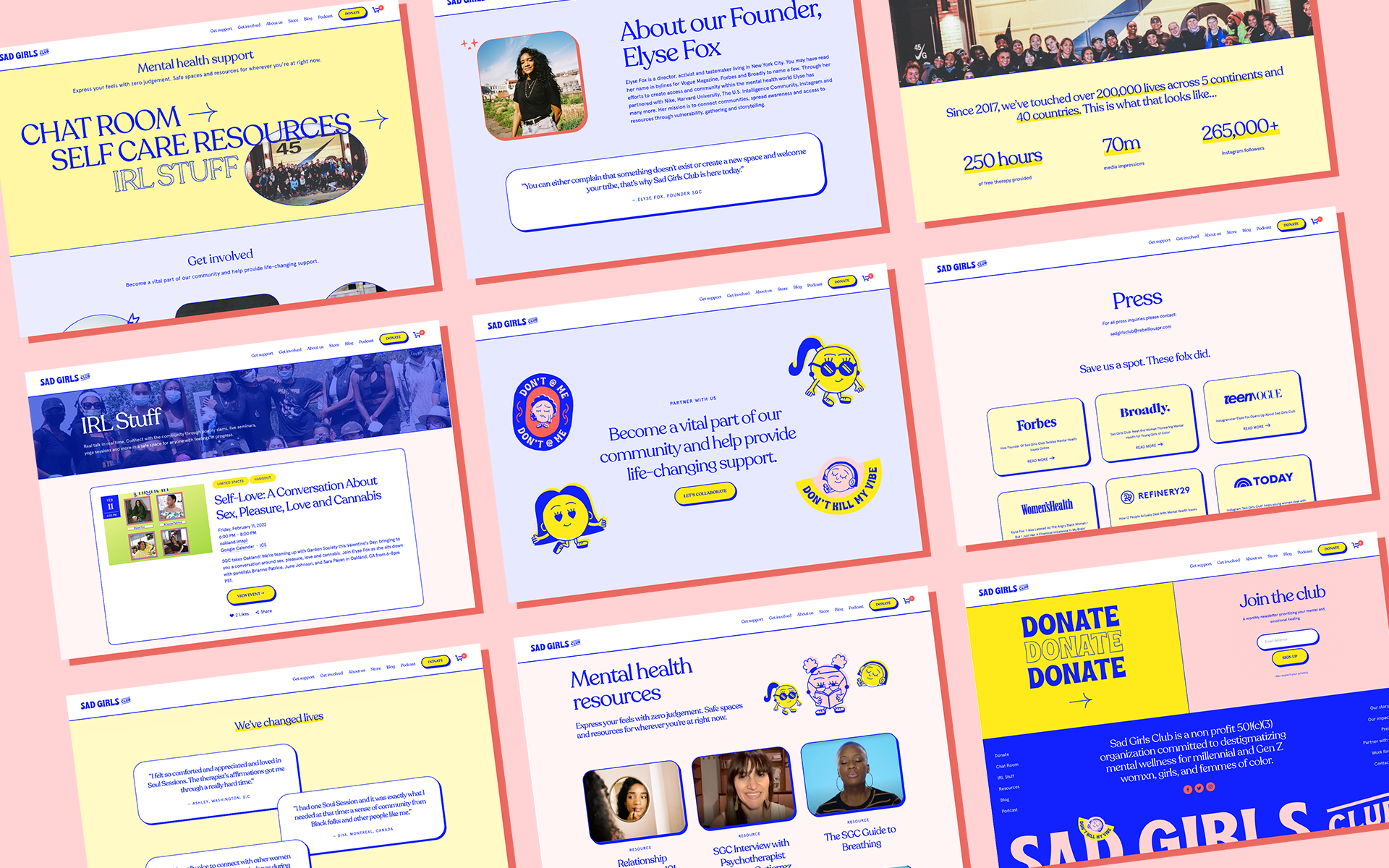
Website design
The brief
When we were asked by Sad Girls Club to work on redefining their brand, it would be an understatement to say we were excited. Sad Girls Club began as a grassroots initiative by founder, Elyse Fox, who found herself suffering with depression in 2017. Elyse wanted to tear down mental health stigma and create a safe space for women (in particular Gen Z and millennial women of colour) who are going through their own journey.
Three years and almost 300k Instagram followers later, Elyse has done just that. Sad Girls Club is a space to express feelings without judgement and this thriving community offers support, workshops, virtual therapist sessions, hosts poetry slams and much, much more.
In approaching the rebrand, we never lost sight of the audience when defining the vision, purpose and personality, as well as the tone of voice, brand and logo design. Mental health is such a complex issue and the beauty of a community like Sad Girls Club is it is accessible and relatable.
Inspiration for the brand line ‘small talk real talk’ (small talk designed with a line crossed through it) came from knowing that communicating with humour, pop culture references and memes is always anchored with a message of hope and understanding. This community digs deeper than the small talk, exploring issues which are both personal and critical for wellbeing.
For the look of Sad Girls Club, founder Elyse Fox was inspired by the bold, graphical style of the 70s and the concept takes this cue, leaning into the reality of mental illness. The logo is both happy and sad, reflecting our own complex emotions and how many of us struggle silently with our mental health. The visual style is confident and inclusive, with a bold, bright colour palette.
We also created a suite of character illustrations, to help give an identity to emotional states like anxiety and frustration and to de-stigmatise them. The characters are quirky, irreverent and bring the whole look and feel together.
We’re so proud to have worked with Sad Girl’s Club on the branding for a mental health community which always has each other’s backs. With this new identity, Sad Girls Club will continue to build their tribe and give invaluable support to hundreds of thousands more young women.
“It was an absolute pleasure working with Tickety Boo Creative on the Sad Girls Club rebrand. Their attention to detail and communication is unmatched. As a founder with a small team, organization is key and they didn’t miss a beat. We are thrilled with our results”
Website Strategy
One of the key considerations while creating the website was understanding the duality of its function. Sad Girls Club has a massive, dedicated following of millennial and Gen Z womxn, girls, and femmes of colour. The website had to feel like a space where they could see themselves reflected through images, language and content, along with a hub for vital mental health resources.
As a non-profit, SGC also need to generate support by way of donations and brand sponsorship. The website needed to compel this audience to give. For context, since the rebrand in early 2020, it has enabled fundraising channels –quadrupling Sad Girls Club’s previous donations – attracting sponsors and partners such as NikeWomen, Gucci, HBO, Victoria’s Secret, Lululemon, Victoria’s Secret and Soho House. This new website would empower them to attract more sponsorship enabling them to offer more free therapy and resources for their members.
Making it happen
We successfully created a website that spoke to these two key audiences effortlessly. Now anyone seeking mental health resources can find them with ease, while sponsors and donators have an entirely tailored user journey. From initial site map scamps to a fully functioning website that can support the Sad Girls Club mission, we worked closely with our client every step of the way. Throughout the project our focus was purely honed on the experiences of the user, whether they were someone visiting the site for support or looking to donate to this incredible cause.
“Tickety Boo has done an incredible job communicating the essence of our brand digitally. I’ve worked with Tickety multiple times and would absolutely come back again, my expectations have not only been met but they’ve definitely surpassed where I thought my brand could be. I tell all of my homegirls about their amazing work ❤️”
What’s next?
Recently, there’s been an exciting new chapter in the Sad Girls Club story. Recording artist Drake featured the logo we created for SGC in his video What’s Next. It’s so encouraging to see such a huge, influential person use their platform to raise awareness for such an important cause.


